주석과 텍스트
Seaborn은 차트 그리기에 집중하는 라이브러리입니다. 텍스트와 주석 기능은 Matplotlib의 것을 그대로 사용합니다.
"Seaborn으로 그린 차트도 결국 Matplotlib 위에서 동작해. 그러니까 Matplotlib의 ax.annotate()나 ax.text() 같은 함수를 그대로 쓸 수 있어."
ax.text(): 특정 위치에 텍스트 추가
ax.text(x, y, text)는 데이터 좌표 기준으로 텍스트를 추가합니다.
# 파일: ax_text_basic.pyimport seaborn as snsimport matplotlib.pyplot as plttips = sns.load_dataset("tips")sns.set_theme(style="whitegrid")fig, ax = plt.subplots(figsize=(8, 6))sns.scatterplot(data=tips, x="total_bill", y="tip", ax=ax, alpha=0.6)# 특정 좌표에 텍스트 추가ax.text( x=45, y=9.5, # 텍스트 위치 (데이터 좌표) s="이상치", # 표시할 텍스트 fontsize=12, color="red", fontweight="bold")ax.set_title("팁 데이터 산점도")plt.show()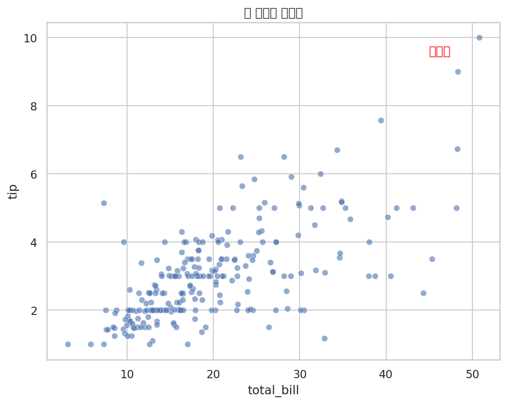
x, y는 데이터의 값과 동일한 단위입니다. total_bill이 45달러, tip이 9.5달러인 위치에 텍스트가 나타납니다.
ax.annotate(): 화살표와 함께 설명 달기
ax.annotate()는 특정 데이터 포인트를 화살표로 가리키며 설명을 달 때 사용합니다.
# 파일: ax_annotate_basic.pyimport seaborn as snsimport matplotlib.pyplot as plttips = sns.load_dataset("tips")sns.set_theme(style="whitegrid")fig, ax = plt.subplots(figsize=(9, 6))sns.scatterplot(data=tips, x="total_bill", y="tip", ax=ax, alpha=0.5)# 화살표로 특정 포인트 강조ax.annotate( text="이상치: 팁이 매우 큽니다", # 텍스트 xy=(50.81, 10), # 화살표 끝점 (가리키는 위치) xytext=(38, 9), # 텍스트 위치 fontsize=11, color="red", arrowprops=dict( arrowstyle="->", # 화살표 스타일 color="red", lw=1.5 ))ax.set_title("이상치 강조 예시")plt.show()
xy는 화살표가 가리키는 데이터 포인트의 좌표, xytext는 텍스트가 표시될 위치입니다. 둘을 다르게 설정하면 화살표가 그 사이를 연결합니다.
arrowprops로 화살표 스타일 바꾸기
# 파일: arrow_styles.pyimport seaborn as snsimport matplotlib.pyplot as plttips = sns.load_dataset("tips")fig, axes = plt.subplots(1, 3, figsize=(18, 5))sns.set_theme(style="whitegrid")arrow_styles = ["->", "-|>", "fancy"]descriptions = ["기본 화살표", "삼각형 화살표", "fancy 스타일"]for ax, style, desc in zip(axes, arrow_styles, descriptions): sns.scatterplot(data=tips, x="total_bill", y="tip", ax=ax, alpha=0.4) ax.annotate( text=desc, xy=(45, 8), xytext=(25, 9.5), fontsize=10, arrowprops=dict(arrowstyle=style, color="darkred", lw=1.5) ) ax.set_title(f"arrowstyle='{style}'")plt.tight_layout()plt.show()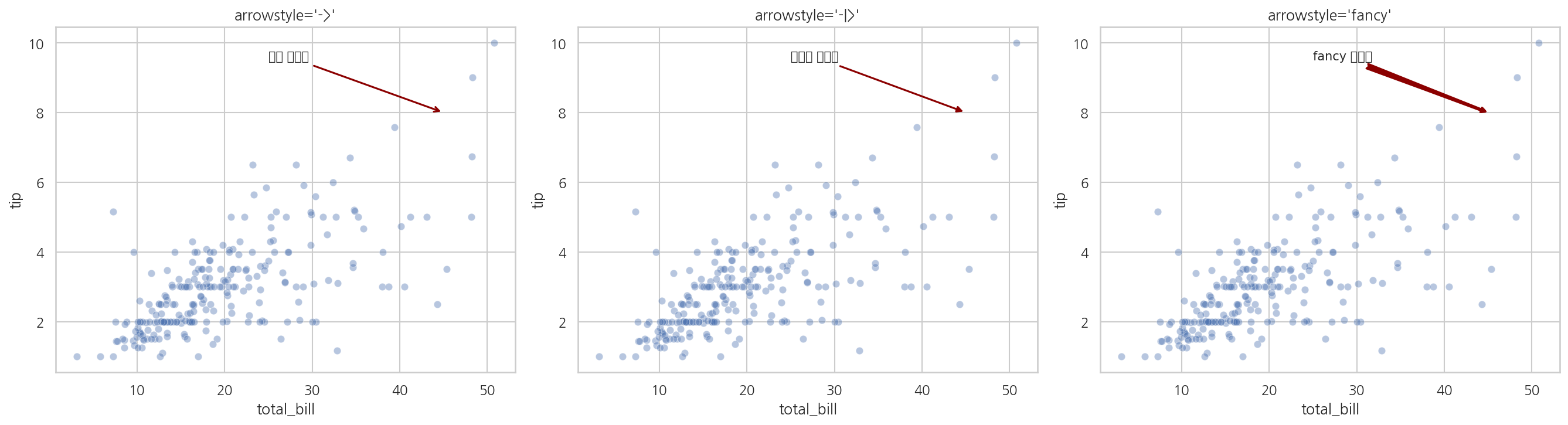
텍스트 박스 스타일링
텍스트에 배경 박스를 추가하면 차트 위에서도 잘 읽힙니다.
# 파일: text_bbox.pyimport seaborn as snsimport matplotlib.pyplot as plttips = sns.load_dataset("tips")sns.set_theme(style="whitegrid")fig, ax = plt.subplots(figsize=(9, 6))sns.scatterplot(data=tips, x="total_bill", y="tip", ax=ax, alpha=0.5)# 배경 박스가 있는 텍스트ax.annotate( text="토요일 저녁\n팁이 가장 많습니다", xy=(45, 8), xytext=(28, 9), fontsize=11, bbox=dict( boxstyle="round,pad=0.3", # 모서리 둥글게 facecolor="lightyellow", # 박스 배경색 edgecolor="orange", # 테두리 색 alpha=0.8 # 투명도 ), arrowprops=dict( arrowstyle="->", color="orange", lw=1.5 ))ax.set_title("텍스트 박스 스타일링")plt.show()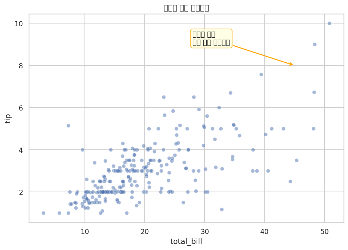
boxstyle의 값으로 "round", "square", "round4", "sawtooth" 등을 사용할 수 있습니다.
Figure-level 차트에서 주석 달기
relplot, pairplot 같은 Figure-level 함수는 Axes 객체를 직접 반환하지 않습니다. .axes 속성으로 개별 Axes에 접근합니다.
# 파일: annotate_figure_level.pyimport seaborn as snsimport matplotlib.pyplot as plttips = sns.load_dataset("tips")# FacetGrid 반환 (Figure-level 함수)g = sns.relplot( data=tips, x="total_bill", y="tip", col="time", hue="smoker")# 첫 번째 칸의 Axes에 주석 추가ax = g.axes[0, 0] # 0행 0열 Axesax.annotate( text="최대 팁", xy=(48, 9), xytext=(30, 9.5), fontsize=10, arrowprops=dict(arrowstyle="->", color="gray"))g.figure.suptitle("시간대·흡연 여부별 팁 분포", y=1.03)plt.show()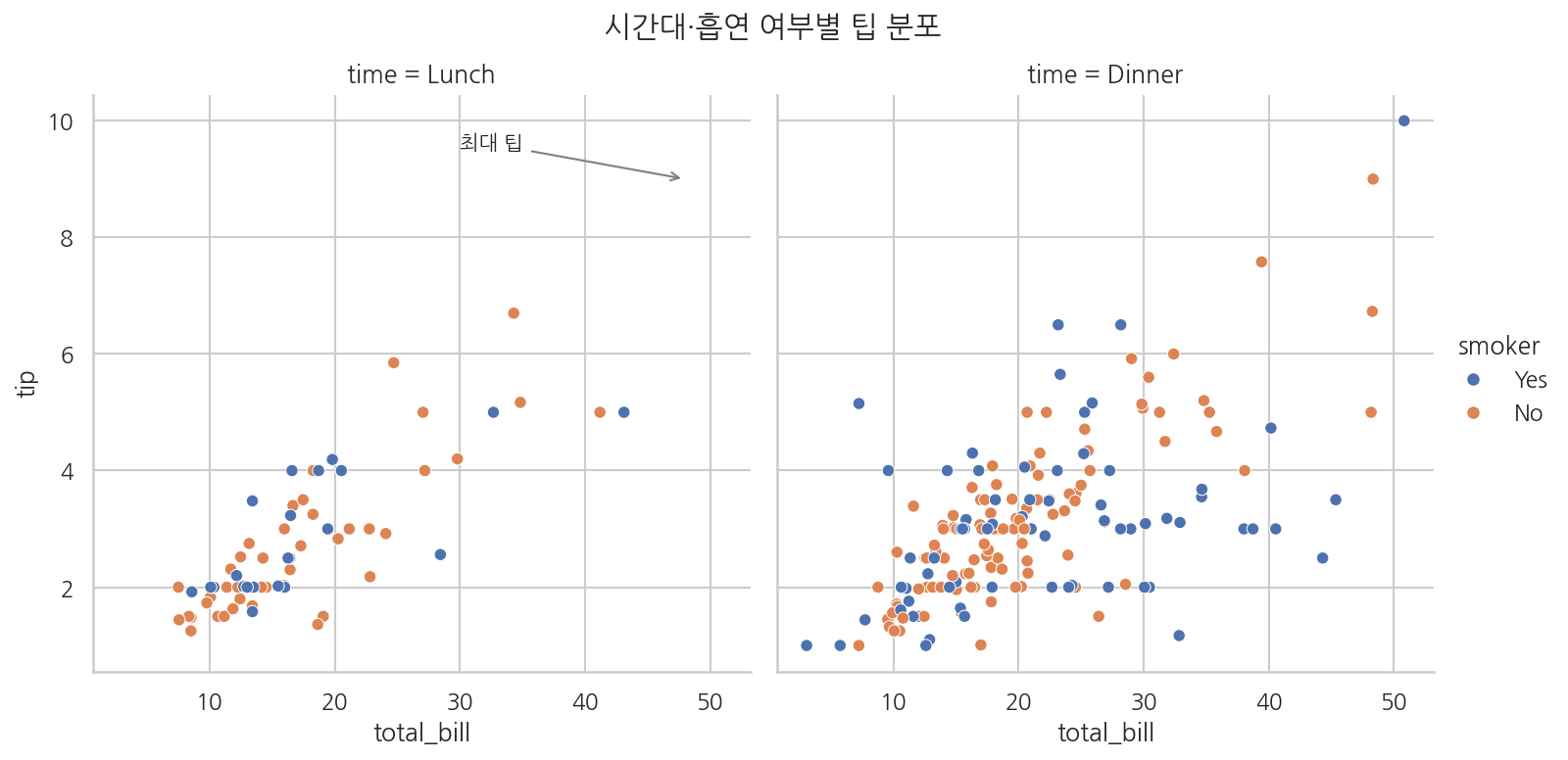
g.axes는 2차원 배열입니다. g.axes[행, 열]로 특정 칸의 Axes에 접근합니다.
여러 포인트에 자동으로 주석 달기
데이터프레임을 순회하면서 여러 포인트에 한꺼번에 주석을 달 수 있습니다.
# 파일: annotate_multiple.pyimport seaborn as snsimport matplotlib.pyplot as pltpenguins = sns.load_dataset("penguins").dropna()sns.set_theme(style="ticks")fig, ax = plt.subplots(figsize=(10, 7))sns.scatterplot( data=penguins, x="bill_length_mm", y="body_mass_g", hue="species", palette="colorblind", style="species", ax=ax, alpha=0.6)# 각 종의 평균값에 주석 달기species_means = penguins.groupby("species")[["bill_length_mm", "body_mass_g"]].mean()for species, row in species_means.iterrows(): ax.annotate( text=f"{species}\n평균", xy=(row["bill_length_mm"], row["body_mass_g"]), xytext=(row["bill_length_mm"] + 1, row["body_mass_g"] + 150), fontsize=9, fontweight="bold", bbox=dict(boxstyle="round,pad=0.2", facecolor="white", edgecolor="gray", alpha=0.7), arrowprops=dict(arrowstyle="->", color="gray", lw=1) )ax.set_title("종별 부리 길이와 몸무게 (평균 표시)")plt.show()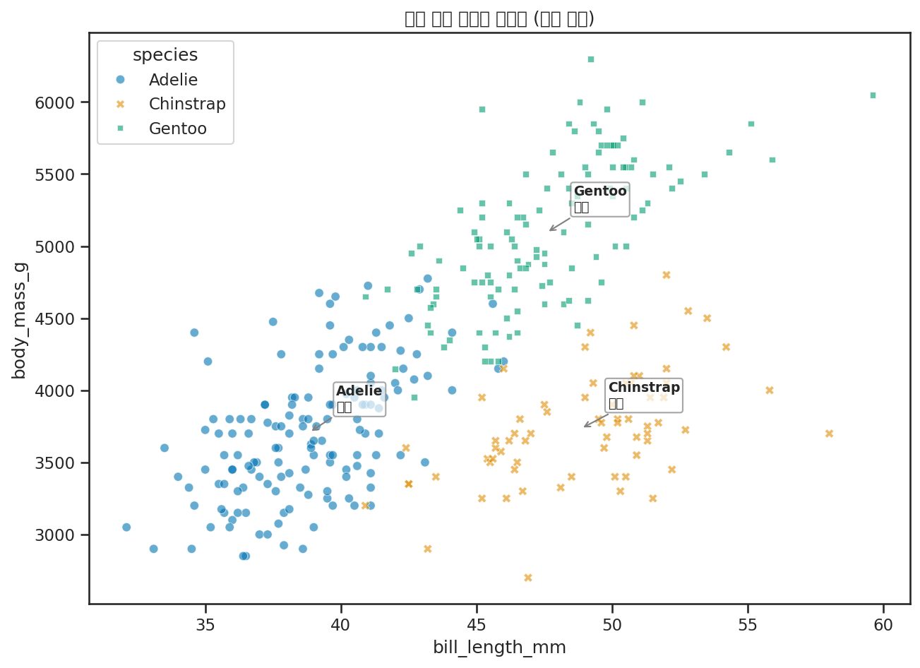
ax.axhline, ax.axvline: 기준선 추가
특정 값에 수평/수직 기준선을 추가합니다.
# 파일: reference_lines.pyimport seaborn as snsimport matplotlib.pyplot as plttips = sns.load_dataset("tips")mean_tip = tips["tip"].mean()sns.set_theme(style="whitegrid")fig, ax = plt.subplots(figsize=(9, 6))sns.scatterplot(data=tips, x="total_bill", y="tip", ax=ax, alpha=0.5)# 평균 팁 기준선ax.axhline( y=mean_tip, color="red", linestyle="--", linewidth=1.5, label=f"평균 팁: ${mean_tip:.2f}")ax.legend()ax.set_title("평균 팁 기준선 표시")plt.show()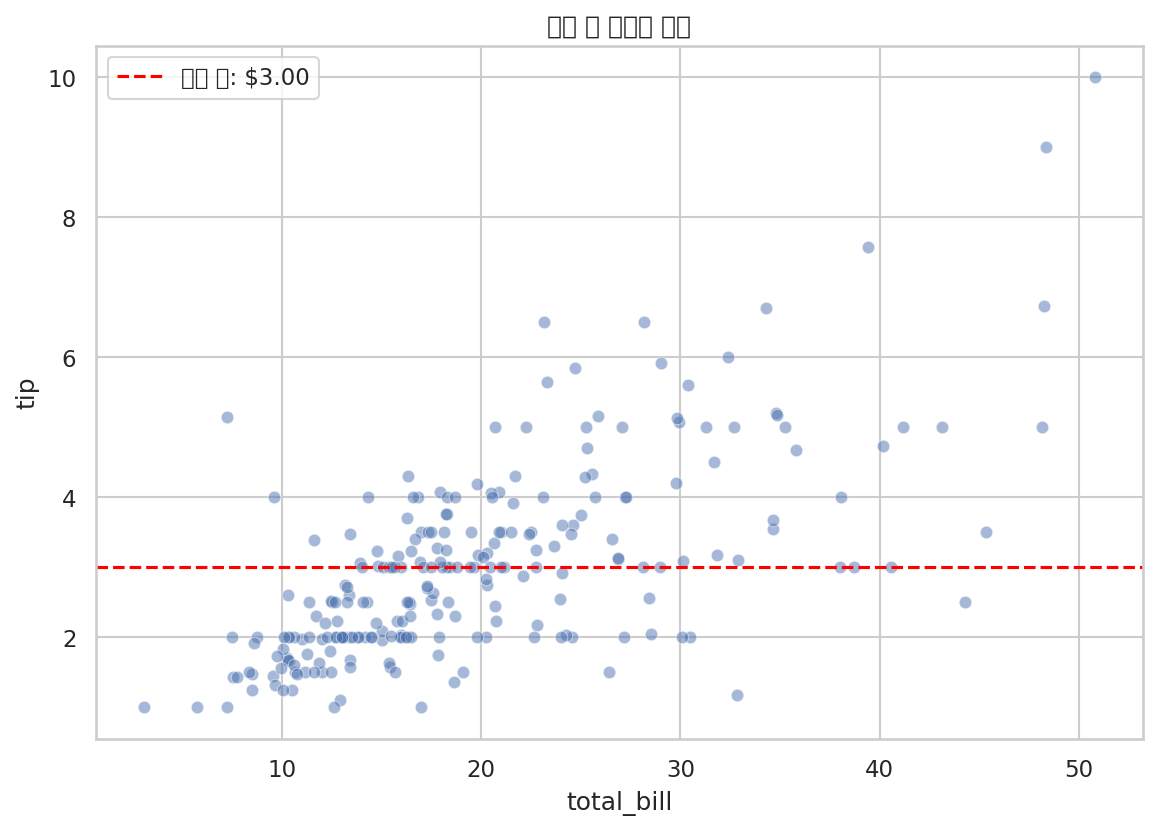
민서의 정리
"차트에 설명을 달 때는 ax.annotate()를 쓰고, 화살표 방향은 xy(목적지)에서 xytext(출발지) 방향으로 그려진다는 걸 기억하면 되겠네요. 그리고 Figure-level 함수는 g.axes[행, 열]로 개별 Axes에 접근해서 주석을 달 수 있고요."
"이제 저장만 하면 끝이야."