공공데이터 시각화
민서의 팀은 서울시 따릉이 이용 데이터를 선택했습니다. "사람들이 언제, 어떻게 따릉이를 타는지 알아보자"는 게 프로젝트의 출발점이었습니다.
실제 공공데이터 포털에서 다운받을 수 있지만, 이 실습에서는 누구나 바로 따라할 수 있도록 샘플 데이터를 직접 생성합니다. 실제 데이터를 받아도 동일한 코드가 동작합니다.
프로젝트 개요
분석 주제: 서울시 공공자전거(따릉이) 월별/요일별/시간대별 이용 패턴 분석
분석 질문
- 월별로 이용건수가 어떻게 변화하는가.
- 요일에 따라 이용 분포가 다른가.
- 하루 중 언제 따릉이를 가장 많이 타는가.
- 계절별로 이용 패턴이 다른가.
1단계: 샘플 데이터 생성
import pandas as pdimport numpy as npimport seaborn as snsimport matplotlib.pyplot as pltimport matplotlib as mpl# 한글 폰트 설정 (macOS)# mpl.rc('font', family='AppleGothic')# Windows: mpl.rc('font', family='Malgun Gothic')# 폰트 설정 없이 영문으로 진행plt.rcParams['axes.unicode_minus'] = Falsenp.random.seed(42)# 2023년 1년치 일별 따릉이 이용 데이터 생성dates = pd.date_range(start="2023-01-01", end="2023-12-31", freq="D")n_days = len(dates)# 계절성: 봄(3~5월), 가을(9~11월)에 이용 증가, 겨울에 감소seasonal_factor = []for d in dates: month = d.month if month in [3, 4, 5]: # 봄 seasonal_factor.append(1.3) elif month in [6, 7, 8]: # 여름 (비 때문에 약간 감소) seasonal_factor.append(1.1) elif month in [9, 10, 11]: # 가을 seasonal_factor.append(1.4) else: # 겨울 seasonal_factor.append(0.7)seasonal_factor = np.array(seasonal_factor)# 요일 효과: 주말에 이용 증가weekday_factor = np.where( pd.Series(dates).dt.dayofweek >= 5, 1.3, 1.0)# 기본 이용건수 + 계절성 + 요일 효과 + 노이즈base = 15000daily_count = ( base * seasonal_factor * weekday_factor + np.random.normal(0, 1500, n_days)).astype(int)daily_count = np.maximum(daily_count, 5000) # 최솟값 보장# 평균 이용시간 (분)avg_duration = ( 18 + seasonal_factor * 3 + np.random.normal(0, 2, n_days))# DataFrame 생성df = pd.DataFrame({ "date": dates, "count": daily_count, "avg_duration": avg_duration.round(1)})df["month"] = df["date"].dt.monthdf["weekday"] = df["date"].dt.day_name()df["season"] = df["month"].map({ 12: "Winter", 1: "Winter", 2: "Winter", 3: "Spring", 4: "Spring", 5: "Spring", 6: "Summer", 7: "Summer", 8: "Summer", 9: "Fall", 10: "Fall", 11: "Fall"})print("=== 데이터 기본 정보 ===")print(df.head())print(f"\n크기: {df.shape}")print(f"\n기본 통계:")print(df[["count", "avg_duration"]].describe().round(1))2단계: 시간대별 데이터 추가 생성
# 시간대별 이용건수 데이터 생성 (월별 × 시간대별)hours = list(range(24))months = list(range(1, 13))hourly_records = []for month in months: # 출퇴근 시간대(7~9시, 17~19시)에 피크 for hour in hours: if 7 <= hour <= 9: factor = 2.0 elif 17 <= hour <= 19: factor = 1.8 elif 12 <= hour <= 13: factor = 1.2 elif 0 <= hour <= 5: factor = 0.2 else: factor = 0.8 # 계절 효과 추가 if month in [3, 4, 5, 9, 10, 11]: season_f = 1.3 elif month in [6, 7, 8]: season_f = 1.1 else: season_f = 0.7 count = int(600 * factor * season_f + np.random.normal(0, 30)) count = max(count, 50) hourly_records.append({ "month": month, "hour": hour, "count": count })hourly_df = pd.DataFrame(hourly_records)print("시간대별 데이터:")print(hourly_df.head(8))3단계: 월별 이용건수 추이 (lineplot)
monthly = df.groupby("month")["count"].agg(["mean", "std"]).reset_index()monthly.columns = ["month", "mean_count", "std_count"]plt.figure(figsize=(10, 5))sns.lineplot(data=monthly, x="month", y="mean_count", marker="o", linewidth=2.5, color="steelblue", label="Daily Average")# 표준편차 범위 음영 처리plt.fill_between( monthly["month"], monthly["mean_count"] - monthly["std_count"], monthly["mean_count"] + monthly["std_count"], alpha=0.2, color="steelblue", label="±1 SD")plt.xticks(range(1, 13), ["Jan", "Feb", "Mar", "Apr", "May", "Jun", "Jul", "Aug", "Sep", "Oct", "Nov", "Dec"])plt.title("Monthly Trend of Ddareungi Usage (2023)")plt.xlabel("Month")plt.ylabel("Daily Average Count")plt.legend()plt.tight_layout()plt.show()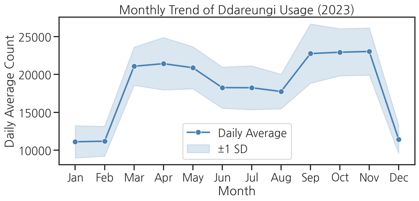
4단계: 요일별 이용 분포 (boxplot)
# 요일 순서 지정weekday_order = ["Monday", "Tuesday", "Wednesday", "Thursday", "Friday", "Saturday", "Sunday"]plt.figure(figsize=(10, 5))sns.boxplot( data=df, x="weekday", y="count", order=weekday_order, hue="weekday", palette="Set2", legend=False)plt.title("Distribution of Daily Usage by Weekday")plt.xlabel("Day of Week")plt.ylabel("Daily Count")plt.xticks(rotation=15)plt.tight_layout()plt.show()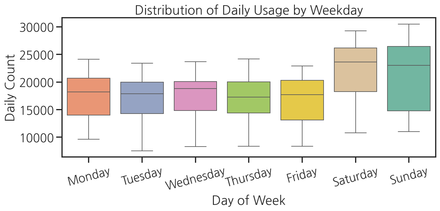
5단계: 시간대별 이용 패턴 (heatmap)
# pivot_table: 행=시간대, 열=월pivot = hourly_df.pivot_table( values="count", index="hour", columns="month", aggfunc="mean")plt.figure(figsize=(12, 8))sns.heatmap( pivot, cmap="YlOrRd", annot=False, # 숫자가 많아 생략 fmt=".0f", linewidths=0, cbar_kws={"label": "Avg Count"}, xticklabels=["Jan", "Feb", "Mar", "Apr", "May", "Jun", "Jul", "Aug", "Sep", "Oct", "Nov", "Dec"], yticklabels=[f"{h:02d}:00" for h in range(24)])plt.title("Hourly Usage Pattern by Month")plt.xlabel("Month")plt.ylabel("Hour of Day")plt.tight_layout()plt.show()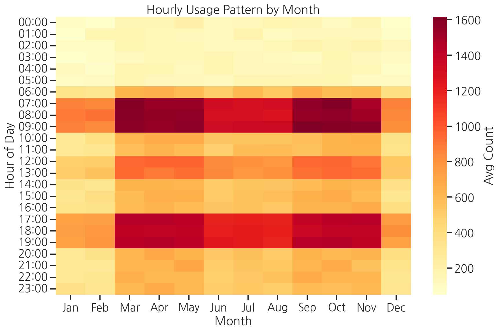
6단계: 계절별 비교 (barplot + FacetGrid)
# FacetGrid로 계절별 요일 패턴 비교season_order = ["Spring", "Summer", "Fall", "Winter"]weekday_short = { "Monday": "Mon", "Tuesday": "Tue", "Wednesday": "Wed", "Thursday": "Thu", "Friday": "Fri", "Saturday": "Sat", "Sunday": "Sun"}df["weekday_short"] = df["weekday"].map(weekday_short)weekday_short_order = ["Mon", "Tue", "Wed", "Thu", "Fri", "Sat", "Sun"]g = sns.FacetGrid( df, col="season", col_order=season_order, height=4, aspect=0.9, sharey=True)g.map_dataframe( sns.barplot, x="weekday_short", y="count", order=weekday_short_order, color="steelblue", errorbar="sd")g.set_axis_labels("Day", "Daily Count")g.set_titles(col_template="{col_name}")g.set_xticklabels(rotation=30)g.figure.suptitle("Daily Usage by Weekday per Season", y=1.02)plt.tight_layout()plt.show()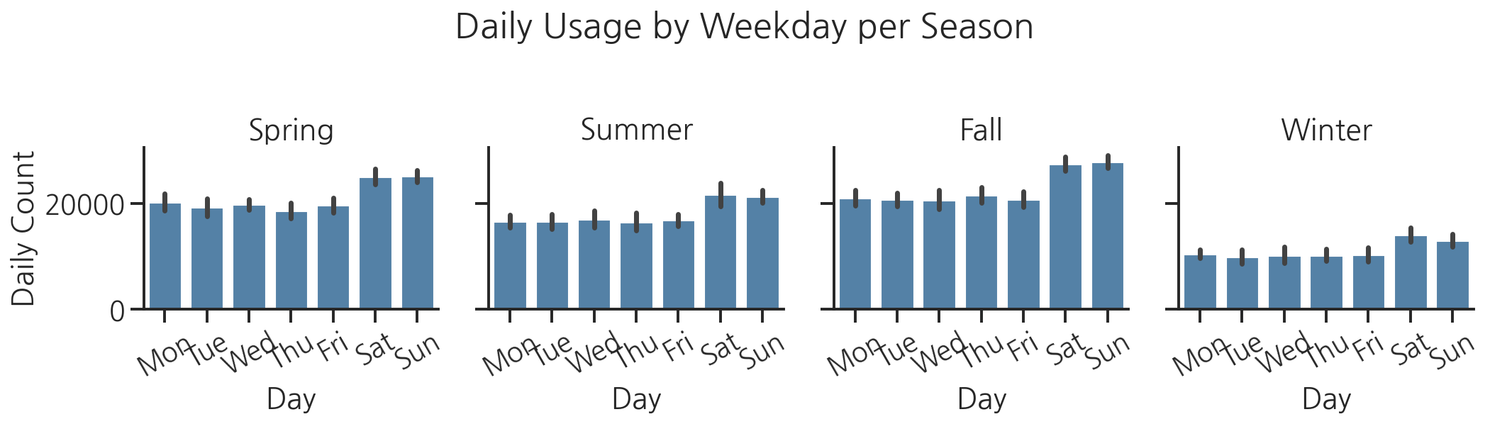
7단계: 최종 대시보드
분석한 차트 4개를 하나의 그림으로 합칩니다. 발표 자료나 보고서에 바로 사용할 수 있는 형태입니다.
fig, axes = plt.subplots(2, 2, figsize=(14, 10))fig.suptitle("Seoul Ddareungi (Public Bike) Usage Analysis 2023", fontsize=14, fontweight="bold", y=1.01)# (0, 0) 월별 추이monthly = df.groupby("month")["count"].mean().reset_index()sns.lineplot(data=monthly, x="month", y="count", marker="o", linewidth=2.5, ax=axes[0, 0])axes[0, 0].set_title("Monthly Trend")axes[0, 0].set_xlabel("Month")axes[0, 0].set_ylabel("Avg Daily Count")axes[0, 0].set_xticks(range(1, 13))axes[0, 0].set_xticklabels( ["J","F","M","A","M","J","J","A","S","O","N","D"])# (0, 1) 요일별 박스플롯sns.boxplot(data=df, x="weekday_short", y="count", order=weekday_short_order, hue="weekday_short", palette="Set2", legend=False, ax=axes[0, 1])axes[0, 1].set_title("Weekday Distribution")axes[0, 1].set_xlabel("Day of Week")axes[0, 1].set_ylabel("Daily Count")axes[0, 1].tick_params(axis='x', rotation=30)# (1, 0) 시간대별 히트맵pivot_small = hourly_df.pivot_table( values="count", index="hour", columns="month", aggfunc="mean")sns.heatmap(pivot_small, cmap="YlOrRd", ax=axes[1, 0], cbar_kws={"shrink": 0.8}, yticklabels=[f"{h:02d}" for h in range(24)])axes[1, 0].set_title("Hourly Pattern by Month")axes[1, 0].set_xlabel("Month")axes[1, 0].set_ylabel("Hour")# (1, 1) 계절별 평균season_avg = df.groupby("season")["count"].mean().reset_index()season_avg_ordered = season_avg.set_index("season").loc[season_order].reset_index()sns.barplot(data=season_avg_ordered, x="season", y="count", palette="coolwarm", ax=axes[1, 1])axes[1, 1].set_title("Average Usage by Season")axes[1, 1].set_xlabel("Season")axes[1, 1].set_ylabel("Avg Daily Count")plt.tight_layout()# 파일 저장plt.savefig("ddareungi_dashboard.png", dpi=150, bbox_inches="tight")print("대시보드 저장 완료: ddareungi_dashboard.png")plt.show()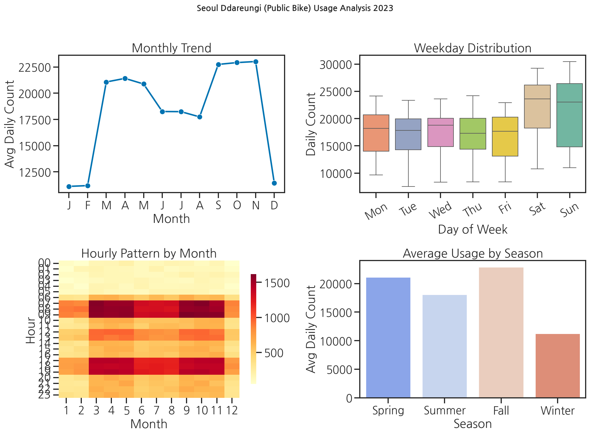
민서가 완성된 대시보드를 보며 말했습니다. "이걸 그냥 발표 슬라이드에 붙이면 되겠네요." 선배가 웃으며 답했습니다. "거기다 인사이트 설명 한 줄씩 달면 완성이야. 그래프가 말을 못 하면 그림일 뿐이거든."
핵심 정리
- 탐색적 데이터 분석(EDA)은 "데이터 로드 → 기본 통계 확인 → 시각화"의 순서로 진행합니다.
pivot_table(values, index, columns, aggfunc)과 heatmap의 조합으로 2차원 패턴을 한눈에 파악합니다.plt.subplots(2, 2)로 여러 차트를 한 화면에 배치하고savefig()로 저장합니다.- 차트마다 인사이트를 설명하는 제목과 레이블을 붙이는 것이 좋은 시각화의 기본입니다.