두 가지 데이터를 한 그래프에 그렸을 때, 어떤 선이 어떤 데이터인지 구분할 수 없다면 차트가 오히려 혼란을 줍니다. 범례가 필요한 순간입니다.
범례 추가
label 파라미터로 각 데이터에 이름을 붙이고, legend()로 범례를 표시합니다.
import matplotlib.pyplot as pltimport matplotlibimport platformmatplotlib.rcParams['font.family'] = {'Windows': 'Malgun Gothic', 'Darwin': 'AppleGothic'}.get(platform.system(), 'NanumGothic')matplotlib.rcParams['axes.unicode_minus'] = Falsemonths = ['1월', '2월', '3월', '4월', '5월']sales_a = [120, 145, 130, 160, 175]sales_b = [100, 110, 125, 140, 155]fig, ax = plt.subplots(figsize=(8, 4))ax.plot(months, sales_a, label='서울점') # label 지정ax.plot(months, sales_b, label='부산점') # label 지정ax.set_title('지점별 매출 비교')ax.legend() # 범례 표시plt.show()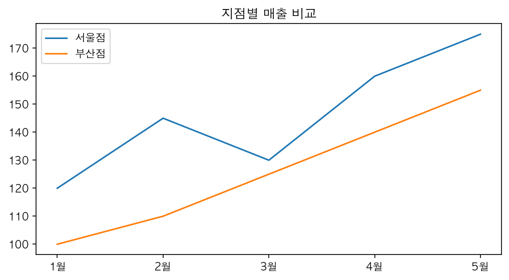
범례 위치 조정
loc 파라미터로 위치를 지정합니다.
ax.legend(loc='upper left') # 왼쪽 위ax.legend(loc='lower right') # 오른쪽 아래ax.legend(loc='best') # 자동 최적 위치 (기본값)| 위치 코드 | 설명 |
|---|---|
'upper left' |
왼쪽 위 |
'upper right' |
오른쪽 위 (기본) |
'lower left' |
왼쪽 아래 |
'lower right' |
오른쪽 아래 |
'center' |
중앙 |
'best' |
데이터와 겹치지 않는 최적 위치 |
그리드 추가
그리드는 데이터 포인트의 정확한 위치를 읽기 쉽게 해주는 보조선입니다.
ax.grid(True) # 기본 그리드ax.grid(True, linestyle='--', alpha=0.5) # 스타일 지정| 파라미터 | 설명 | 예시 |
|---|---|---|
linestyle |
선 스타일 | '-', '--', ':' |
alpha |
투명도 (0~1) | 0.3, 0.5, 0.7 |
color |
색상 | 'gray', '#cccccc' |
axis |
적용 축 | 'x', 'y', 'both' |
y축 그리드만 표시
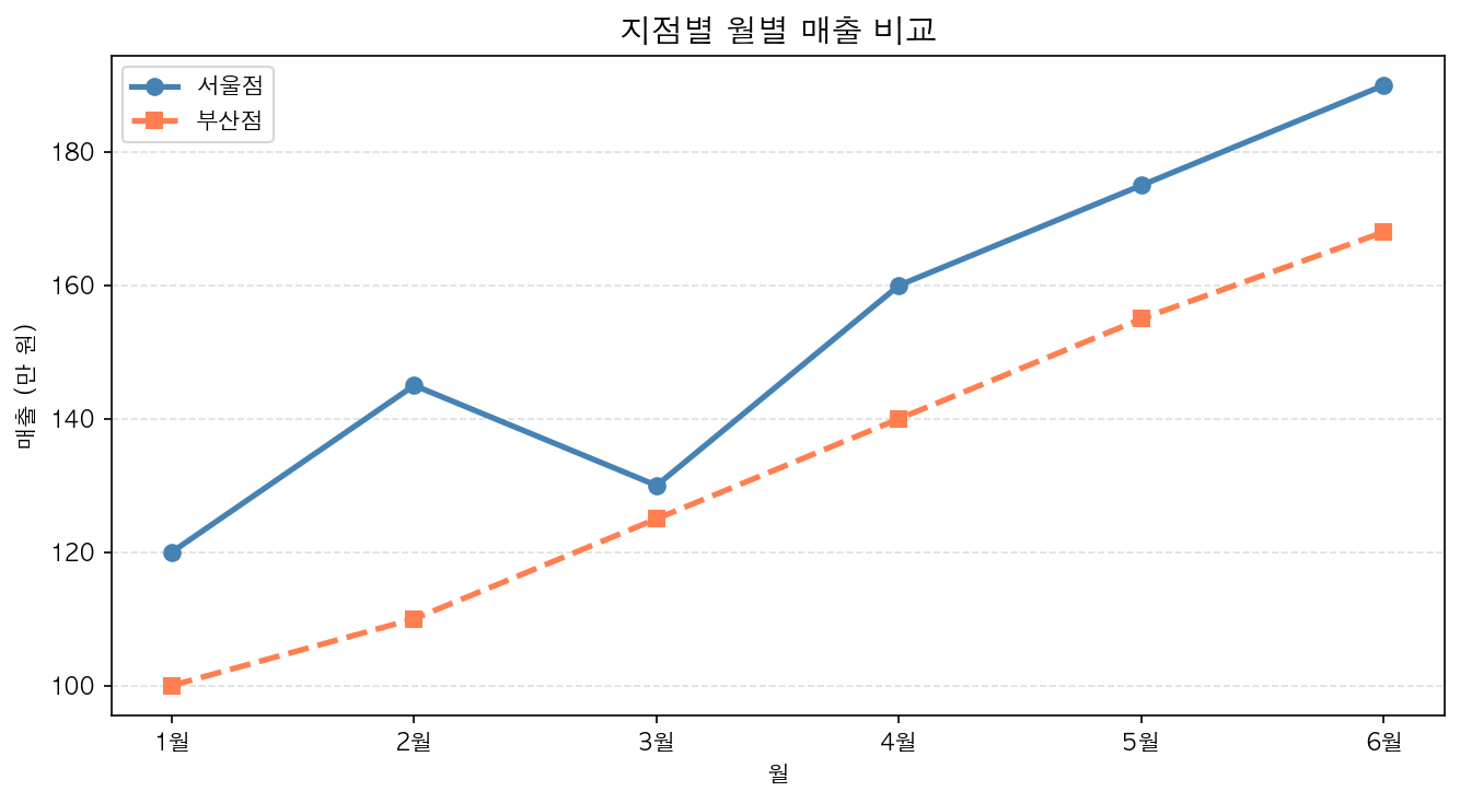
ax.grid(True, axis='y', linestyle='--', alpha=0.4)실무 보고서에서는 y축 그리드만 쓰는 경우가 많습니다. x축 그리드까지 있으면 시각적으로 복잡해집니다.
전체 예제
fig, ax = plt.subplots(figsize=(9, 5))ax.plot(months, sales_a, label='서울점', color='steelblue', linewidth=2)ax.plot(months, sales_b, label='부산점', color='coral', linewidth=2)ax.set_title('지점별 월별 매출 비교', fontsize=15, fontweight='bold')ax.set_xlabel('월')ax.set_ylabel('매출 (만 원)')ax.legend(loc='upper left')ax.grid(True, axis='y', linestyle='--', alpha=0.4)plt.tight_layout()plt.show()