"이제 실제 데이터를 써볼 시간이에요."
팀장이 지윤에게 마지막 과제를 줬다. 행정안전부 공공데이터 포털에서 지역별 인구 데이터를 내려받아 시각화하는 것이다.
데이터 준비
# 공공데이터 포털에서 내려받은 CSV 예시를 직접 생성import pandas as pdimport matplotlib.pyplot as pltimport matplotlibimport platformmatplotlib.rcParams['font.family'] = {'Windows': 'Malgun Gothic', 'Darwin': 'AppleGothic'}.get(platform.system(), 'NanumGothic')matplotlib.rcParams['axes.unicode_minus'] = False# 시도별 인구 (2026년 기준, 만 명 단위)data = { '시도': ['서울', '경기', '부산', '인천', '대구', '대전', '광주', '울산', '세종'], '인구': [933, 1385, 334, 295, 237, 146, 143, 112, 39], '전년대비': [-0.3, 0.8, -0.5, 0.2, -0.6, -0.1, -0.2, -0.4, 2.1]}df = pd.DataFrame(data)df = df.sort_values('인구', ascending=True) # 오름차순 정렬fig, (ax1, ax2) = plt.subplots(1, 2, figsize=(14, 6))# 왼쪽: 수평 막대 (인구)bars = ax1.barh(df['시도'], df['인구'], color='steelblue', height=0.6)ax1.set_xlabel('인구 (만 명)')ax1.set_title('시도별 인구', fontsize=13, fontweight='bold')for bar in bars: width = bar.get_width() ax1.text(width + 5, bar.get_y() + bar.get_height()/2, f'{width}만', va='center', fontsize=9)# 오른쪽: 수평 막대 (전년 대비, 색상 분기)colors = ['coral' if v < 0 else 'teal' for v in df['전년대비']]ax2.barh(df['시도'], df['전년대비'], color=colors, height=0.6)ax2.axvline(0, color='black', linewidth=0.8)ax2.set_xlabel('전년 대비 변화율 (%)')ax2.set_title('전년 대비 인구 변화율', fontsize=13, fontweight='bold')plt.suptitle('2026년 시도별 인구 현황', fontsize=15, fontweight='bold')plt.tight_layout()plt.savefig('population_2026.png', dpi=150, bbox_inches='tight')plt.show()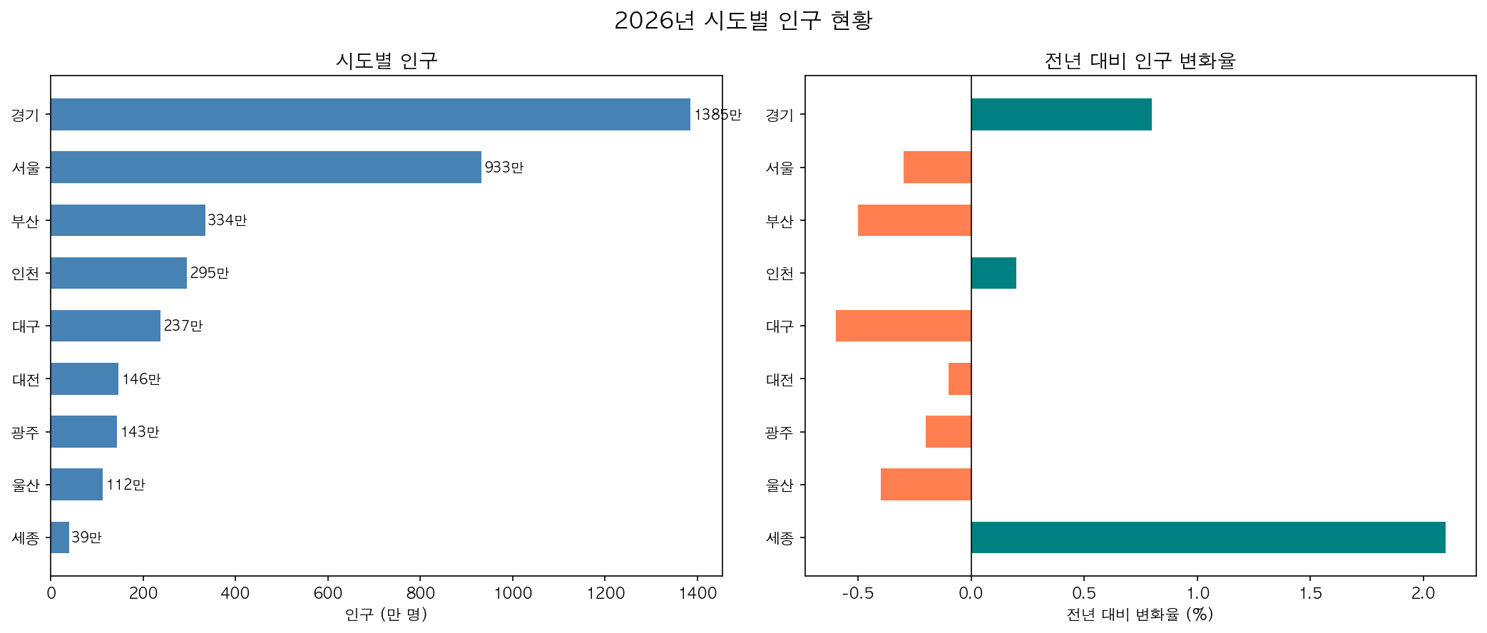
감소(빨강)와 증가(초록)를 색상으로 직관적으로 구분하는 것이 핵심입니다. 세종시가 유일하게 증가세를 보입니다.