hist() — 히스토그램
데이터가 어떻게 분포되어 있는지 보여줍니다. 구간(bins)을 나눠 각 구간에 속하는 데이터 개수를 막대로 표시합니다.
import matplotlib.pyplot as pltimport numpy as npimport matplotlibimport platformmatplotlib.rcParams['font.family'] = {'Windows': 'Malgun Gothic', 'Darwin': 'AppleGothic'}.get(platform.system(), 'NanumGothic')matplotlib.rcParams['axes.unicode_minus'] = Falsenp.random.seed(42)ages = np.random.normal(35, 10, 500) # 평균 35, 표준편차 10, 500명fig, ax = plt.subplots(figsize=(9, 5))ax.hist(ages, bins=20, color='steelblue', edgecolor='white', alpha=0.8)ax.set_title('고객 나이 분포', fontsize=14)ax.set_xlabel('나이')ax.set_ylabel('빈도')ax.axvline(ages.mean(), color='red', linestyle='--', linewidth=2, label=f'평균: {ages.mean():.1f}')ax.legend()ax.grid(True, axis='y', linestyle='--', alpha=0.4)plt.tight_layout()plt.show()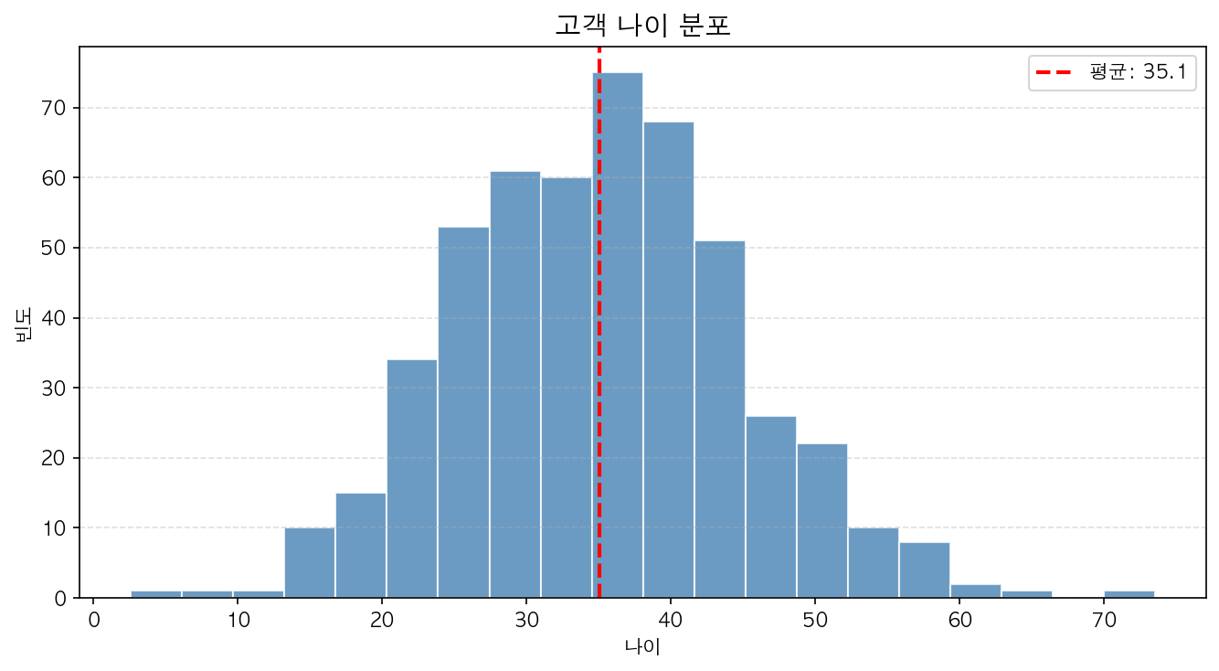
bins 조정
bins는 구간 수 또는 구간 경계를 지정합니다.
ax.hist(ages, bins=10) # 10개 구간ax.hist(ages, bins=np.arange(10, 70, 5)) # 5살 단위ax.hist(ages, bins='auto') # 자동 결정