"이 그래프에서 3월이 갑자기 떨어지는 이유를 화살표로 표시할 수 없을까요?"
지윤의 요청에 팀장이 annotate()를 가르쳐줬다.
annotate() — 화살표 주석
import matplotlib.pyplot as pltimport matplotlibimport platformmatplotlib.rcParams['font.family'] = {'Windows': 'Malgun Gothic', 'Darwin': 'AppleGothic'}.get(platform.system(), 'NanumGothic')matplotlib.rcParams['axes.unicode_minus'] = Falsemonths = ['1월', '2월', '3월', '4월', '5월', '6월']sales = [120, 145, 90, 160, 175, 190] # 3월이 갑자기 하락fig, ax = plt.subplots(figsize=(10, 5))ax.plot(months, sales, color='steelblue', linewidth=2, marker='o')# 하락 지점에 주석 추가ax.annotate( '3월: 대형 사고로 매출 급감', # 텍스트 xy=('3월', 90), # 화살표 끝점 (주석 대상) xytext=('3월', 130), # 텍스트 위치 fontsize=11, arrowprops=dict( arrowstyle='->', color='red', lw=2 ), color='red')ax.set_title('월별 매출 추이', fontsize=14)ax.set_ylabel('매출 (만 원)')ax.grid(True, axis='y', linestyle='--', alpha=0.4)plt.tight_layout()plt.show()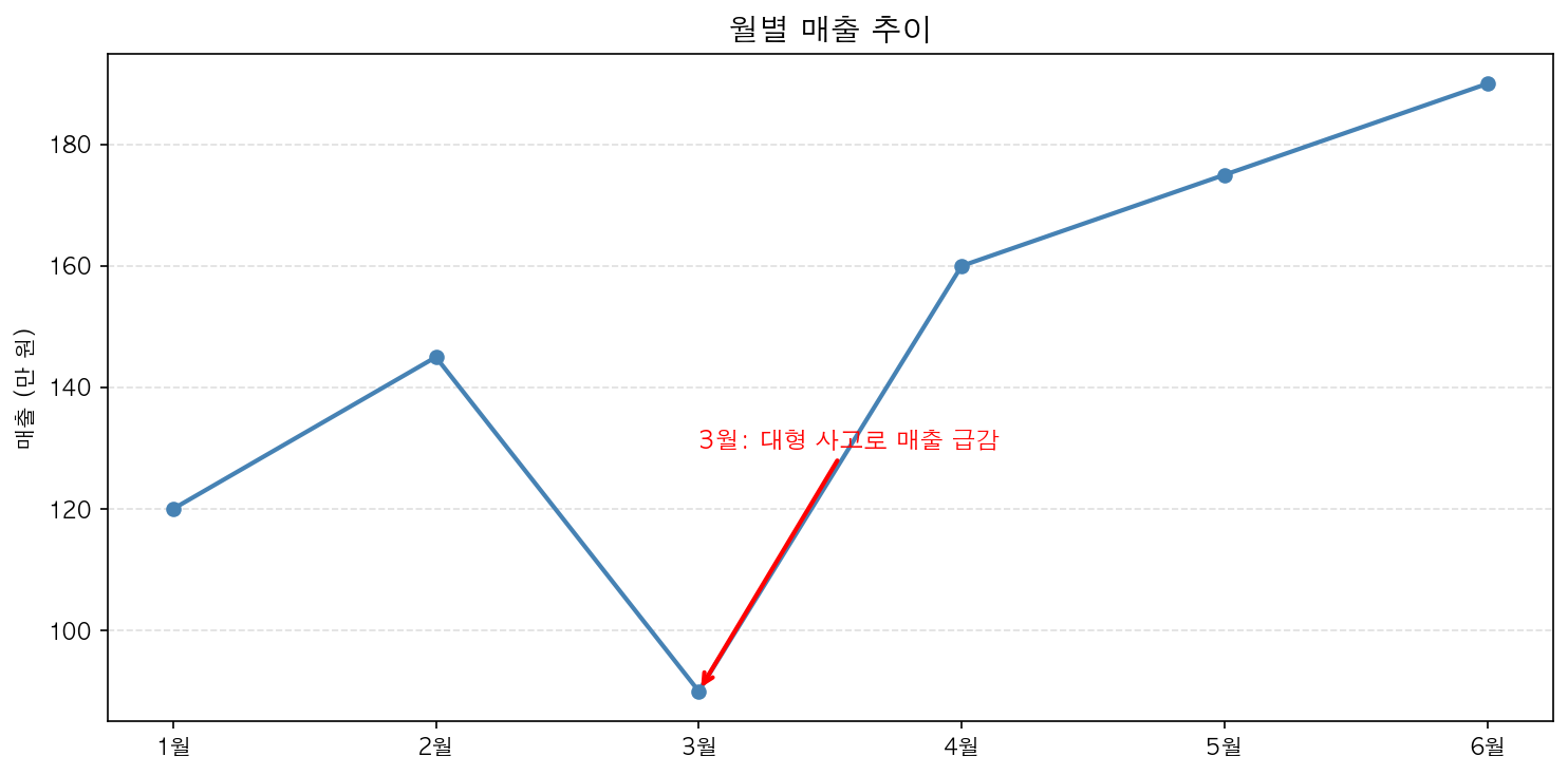
text() — 단순 텍스트
화살표 없이 텍스트만 추가합니다.
ax.text( x=2, # x 좌표 y=150, # y 좌표 s='최고점', # 텍스트 fontsize=12, color='darkblue', ha='center', # 수평 정렬: 'left', 'center', 'right' va='bottom' # 수직 정렬: 'top', 'center', 'bottom')수식 표현 (LaTeX)
$로 감싸면 수식 표현이 가능합니다.
ax.set_title(r'$y = \sin(x)$', fontsize=14)ax.text(1.5, 0.8, r'$f(x) = e^{-x^2}$', fontsize=13)