"데이터가 DataFrame 형태로 있을 때 그래프 그리는 게 훨씬 간편해요."
팀장이 지윤에게 새로운 방법을 소개했다. DataFrame에는 .plot() 메서드가 내장되어 있다.
DataFrame.plot() 기본
import pandas as pdimport matplotlib.pyplot as pltimport matplotlibimport platformmatplotlib.rcParams['font.family'] = {'Windows': 'Malgun Gothic', 'Darwin': 'AppleGothic'}.get(platform.system(), 'NanumGothic')matplotlib.rcParams['axes.unicode_minus'] = False# 샘플 데이터df = pd.DataFrame({ '서울': [120, 145, 130, 160, 175, 190], '부산': [100, 110, 125, 140, 155, 168], '제주': [80, 95, 115, 150, 180, 200],}, index=['1월', '2월', '3월', '4월', '5월', '6월'])# 선 그래프 (기본)df.plot(figsize=(10, 5), marker='o')plt.title('지점별 방문자 수')plt.ylabel('방문자 수 (명)')plt.tight_layout()plt.show()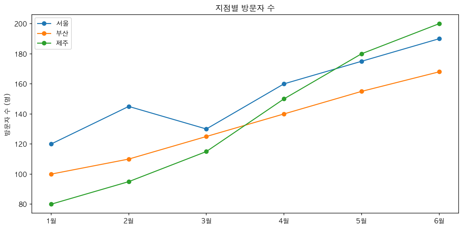
kind 파라미터로 차트 유형 변경
df.plot(kind='bar', figsize=(10, 5)) # 막대 그래프df.plot(kind='barh', figsize=(10, 5)) # 수평 막대df.plot(kind='area', figsize=(10, 5)) # 영역 차트df.plot(kind='pie', subplots=True) # 원형 차트 (열마다)df.plot(kind='box', figsize=(8, 5)) # 박스플롯df.plot(kind='hist', figsize=(8, 5)) # 히스토그램df.plot(kind='scatter', x='서울', y='부산') # 산점도인덱스 활용
df.index = pd.date_range('2026-01-01', periods=6, freq='MS')df.plot(figsize=(12, 5)) # x축이 자동으로 날짜 형식