"오늘부터 진짜 실무 데이터를 써볼 거예요."
팀장이 CSV 파일 하나를 지윤에게 전달했다. 지난 6개월간의 월별 방문자 수 데이터였다.
plot() 기본 사용법
선 그래프는 ax.plot(x, y) 하나로 시작합니다.
import matplotlib.pyplot as pltimport matplotlibimport platformmatplotlib.rcParams['font.family'] = {'Windows': 'Malgun Gothic', 'Darwin': 'AppleGothic'}.get(platform.system(), 'NanumGothic')matplotlib.rcParams['axes.unicode_minus'] = Falsemonths = ['1월', '2월', '3월', '4월', '5월', '6월']visitors = [1200, 1450, 1300, 1600, 1750, 1900]fig, ax = plt.subplots(figsize=(9, 5))ax.plot(months, visitors, color='steelblue', linewidth=2, marker='o')ax.set_title('월별 방문자 수', fontsize=15)ax.set_xlabel('월')ax.set_ylabel('방문자 수 (명)')ax.grid(True, axis='y', linestyle='--', alpha=0.4)plt.tight_layout()plt.show()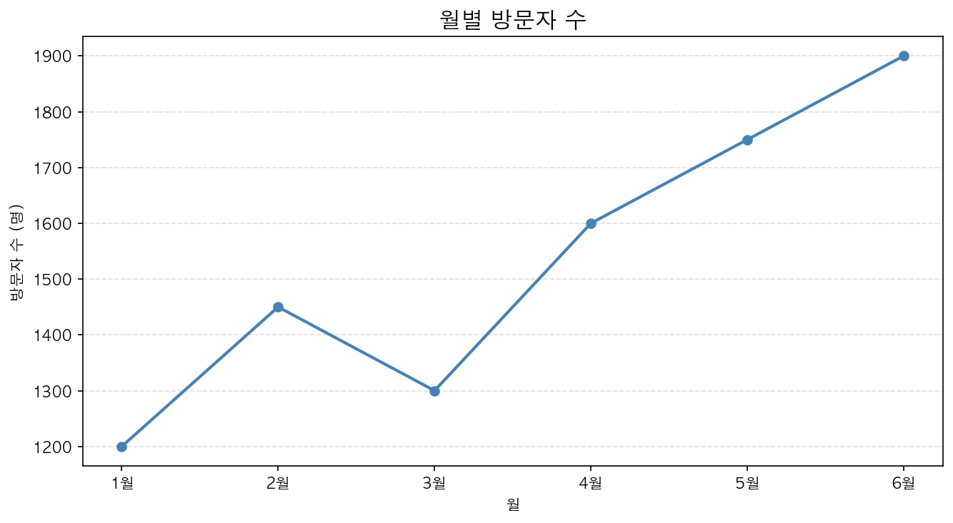
데이터를 넣는 두 가지 방법
리스트로 직접 전달
ax.plot([1, 2, 3, 4, 5], [10, 20, 30, 25, 40])NumPy 배열 사용
import numpy as npx = np.linspace(0, 2 * np.pi, 100) # 0부터 2π까지 100개 점y = np.sin(x)ax.plot(x, y)fill_between — 영역 채우기
선 그래프에서 특정 범위를 색으로 채울 때 사용합니다.
ax.plot(months, visitors, color='steelblue', linewidth=2)ax.fill_between(months, visitors, alpha=0.15, color='steelblue')