"색상이랑 선 스타일을 바꾸고 싶으면 어떻게 해요?"
지윤이 물었다. 팀장 보고서의 그래프는 파랗고 빨개서 깔끔한데, 본인 것은 기본 색상 그대로라 밋밋하게 느껴졌다.
색상 지정
color 파라미터로 선 색상을 지정합니다.
ax.plot(x, y, color='steelblue') # 이름으로 지정ax.plot(x, y, color='#e74c3c') # HEX 코드로 지정ax.plot(x, y, color=(0.2, 0.4, 0.8)) # RGB 튜플 (0~1 범위)자주 쓰는 색상 이름 예시: 'blue', 'red', 'green', 'gray', 'black', 'orange', 'steelblue', 'coral', 'teal'
선 스타일
ax.plot(x, y, linestyle='-') # 실선 (기본)ax.plot(x, y, linestyle='--') # 점선ax.plot(x, y, linestyle=':') # 점점선ax.plot(x, y, linestyle='-.') # 점선+실선선 굵기
ax.plot(x, y, linewidth=1) # 얇은 선 (기본: 1.5)ax.plot(x, y, linewidth=2.5) # 보통ax.plot(x, y, linewidth=4) # 두꺼운 선마커
데이터 포인트를 점으로 강조할 때 마커를 사용합니다.
ax.plot(x, y, marker='o') # 원형 마커ax.plot(x, y, marker='s') # 사각형ax.plot(x, y, marker='^') # 삼각형ax.plot(x, y, marker='D') # 마름모마커 크기와 색상도 조정할 수 있습니다.
ax.plot(x, y, marker='o', markersize=8, markerfacecolor='white', # 마커 내부 색 markeredgecolor='steelblue', # 마커 테두리 색 markeredgewidth=2)단축 형식 (fmt)
색상, 마커, 선 스타일을 한 문자열로 지정할 수 있습니다.
ax.plot(x, y, 'b-o') # 파란색, 실선, 원형 마커ax.plot(x, y, 'r--s') # 빨간색, 점선, 사각형 마커ax.plot(x, y, 'g:^') # 초록색, 점점선, 삼각형 마커형식: [색상][선스타일][마커]
전체 예제
import matplotlib.pyplot as pltimport matplotlibimport platformmatplotlib.rcParams['font.family'] = {'Windows': 'Malgun Gothic', 'Darwin': 'AppleGothic'}.get(platform.system(), 'NanumGothic')matplotlib.rcParams['axes.unicode_minus'] = Falsemonths = ['1월', '2월', '3월', '4월', '5월', '6월']sales_a = [120, 145, 130, 160, 175, 190]sales_b = [100, 110, 125, 140, 155, 168]fig, ax = plt.subplots(figsize=(9, 5))ax.plot(months, sales_a, color='steelblue', linewidth=2.5, marker='o', markersize=7, label='서울점')ax.plot(months, sales_b, color='coral', linewidth=2.5, marker='s', markersize=7, linestyle='--', label='부산점')ax.set_title('지점별 상반기 매출', fontsize=15, fontweight='bold')ax.set_xlabel('월')ax.set_ylabel('매출 (만 원)')ax.legend(loc='upper left')ax.grid(True, axis='y', linestyle='--', alpha=0.4)plt.tight_layout()plt.show()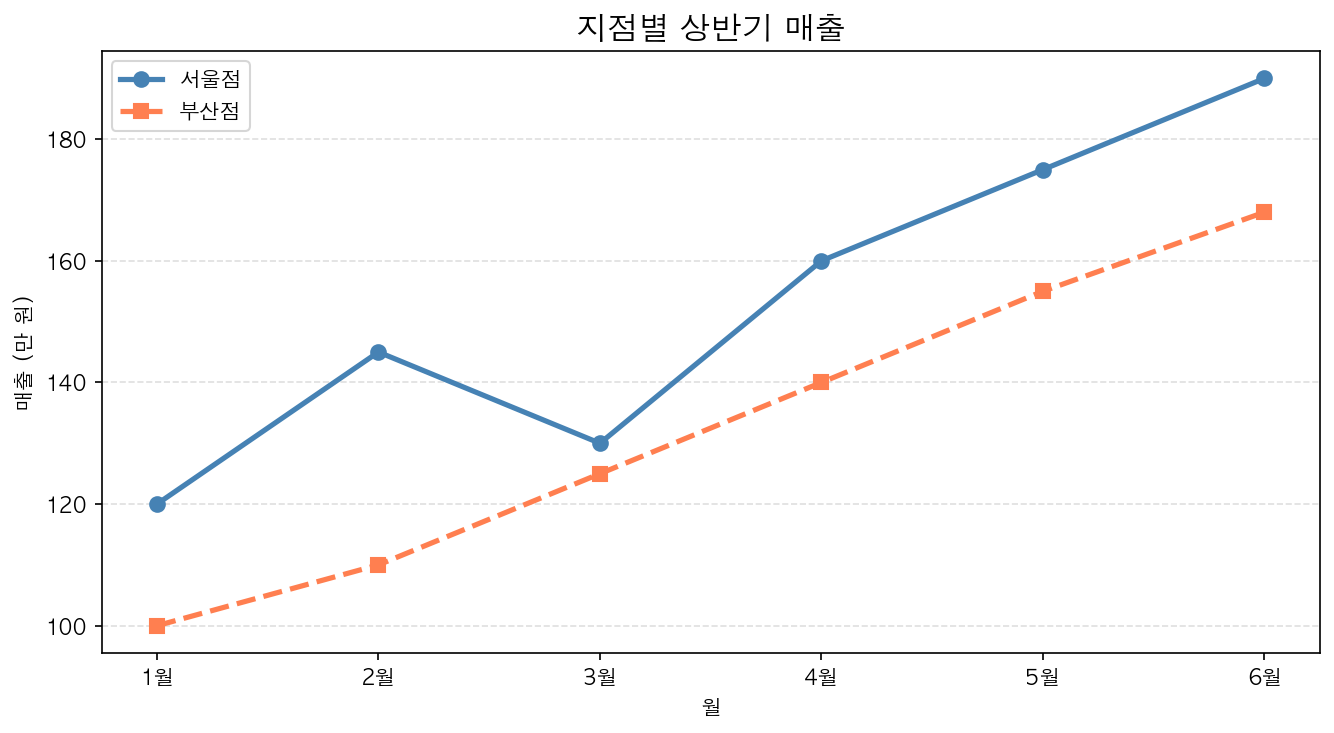
"이제 보고서에 올려도 될 것 같아요." 지윤은 완성된 그래프를 보며 뿌듯함을 느꼈다.
PART 1을 통해 지윤은 Matplotlib의 기본을 완전히 익혔다. 설치부터 한글 설정, 두 가지 API 방식의 차이, 그리고 보고서에 쓸 수 있는 수준의 그래프까지. 이제 다양한 차트를 배울 준비가 됐다.