"월별 트렌드는 선 그래프가 좋은데, 카테고리별 비교는 막대 그래프가 더 직관적이에요."
팀장의 말대로 제품 카테고리별 매출을 선 그래프로 그렸더니 이상하게 보였다. 연속된 데이터가 아니라 독립된 카테고리이기 때문이다.
bar() — 수직 막대 그래프
import matplotlib.pyplot as pltimport matplotlibimport platformmatplotlib.rcParams['font.family'] = {'Windows': 'Malgun Gothic', 'Darwin': 'AppleGothic'}.get(platform.system(), 'NanumGothic')matplotlib.rcParams['axes.unicode_minus'] = Falsecategories = ['전자제품', '의류', '식품', '가구', '스포츠']sales = [4500, 3200, 5100, 2800, 3700]fig, ax = plt.subplots(figsize=(9, 5))bars = ax.bar(categories, sales, color='steelblue', width=0.6)ax.set_title('카테고리별 매출', fontsize=15)ax.set_xlabel('카테고리')ax.set_ylabel('매출 (만 원)')ax.grid(True, axis='y', linestyle='--', alpha=0.4)plt.tight_layout()plt.show()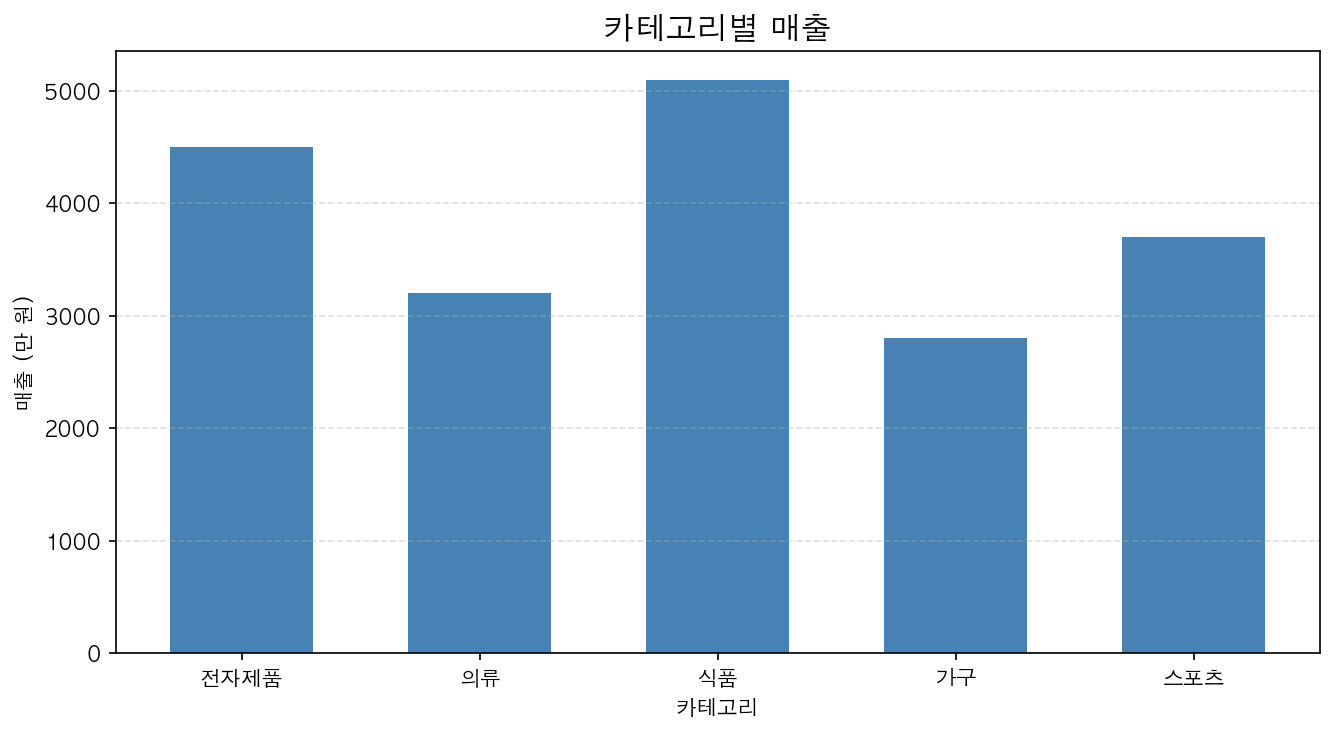
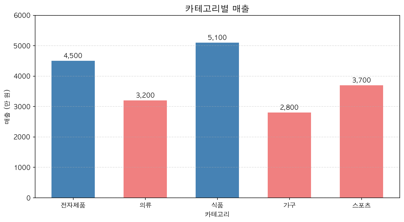
막대 위에 값 표시
for bar in bars: height = bar.get_height() ax.text(bar.get_x() + bar.get_width() / 2., height, f'{height:,}', ha='center', va='bottom', fontsize=10)막대 색상을 데이터에 따라 다르게
colors = ['steelblue' if s >= 4000 else 'lightcoral' for s in sales]ax.bar(categories, sales, color=colors)