그룹 막대 그래프
여러 그룹의 값을 같은 카테고리 안에서 나란히 비교합니다.
import numpy as npimport matplotlib.pyplot as pltimport matplotlibimport platformmatplotlib.rcParams['font.family'] = {'Windows': 'Malgun Gothic', 'Darwin': 'AppleGothic'}.get(platform.system(), 'NanumGothic')matplotlib.rcParams['axes.unicode_minus'] = Falsequarters = ['1분기', '2분기', '3분기', '4분기']online = [3200, 4100, 3800, 5200]offline = [2800, 2600, 3000, 3500]x = np.arange(len(quarters)) # [0, 1, 2, 3]width = 0.35fig, ax = plt.subplots(figsize=(10, 5))ax.bar(x - width/2, online, width, label='온라인', color='steelblue')ax.bar(x + width/2, offline, width, label='오프라인', color='coral')ax.set_title('분기별 채널별 매출', fontsize=14)ax.set_xlabel('분기')ax.set_ylabel('매출 (만 원)')ax.set_xticks(x)ax.set_xticklabels(quarters)ax.legend()ax.grid(True, axis='y', linestyle='--', alpha=0.4)plt.tight_layout()plt.show()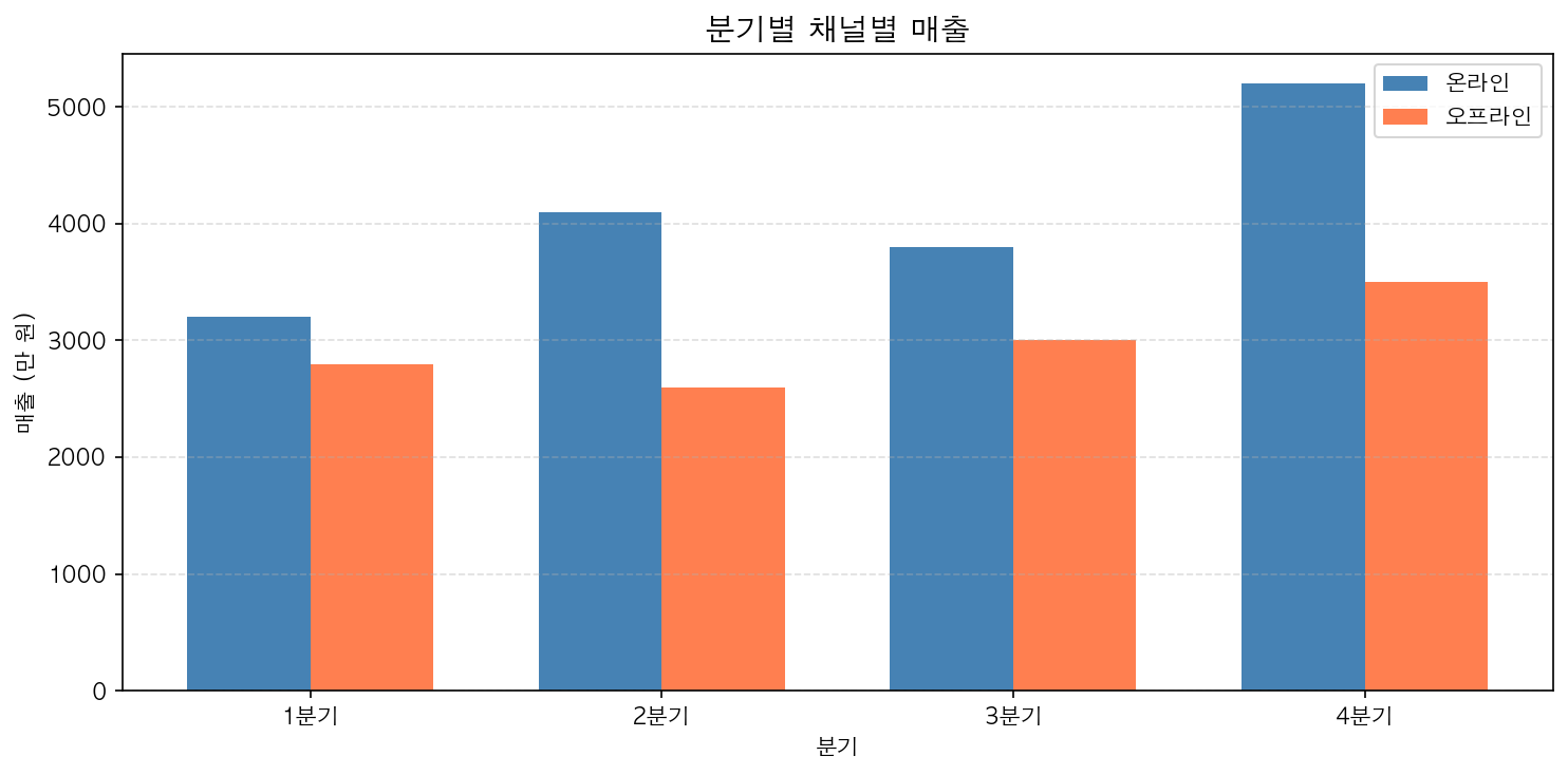
스택 막대 그래프
각 항목의 절대값과 전체 합계를 동시에 보여줍니다.
fig, ax = plt.subplots(figsize=(10, 5))ax.bar(quarters, online, label='온라인', color='steelblue')ax.bar(quarters, offline, label='오프라인', color='coral', bottom=online) # bottom 파라미터로 시작 위치 지정ax.set_title('분기별 채널별 매출 (누적)', fontsize=14)ax.set_ylabel('매출 (만 원)')ax.legend()ax.grid(True, axis='y', linestyle='--', alpha=0.4)plt.tight_layout()plt.show()bottom 파라미터가 스택의 핵심입니다. 두 번째 막대의 시작점을 첫 번째 막대의 값으로 설정합니다.