scatter() — 산점도
두 변수 사이의 상관관계를 보여줍니다.
import matplotlib.pyplot as pltimport numpy as npimport matplotlibimport platformmatplotlib.rcParams['font.family'] = {'Windows': 'Malgun Gothic', 'Darwin': 'AppleGothic'}.get(platform.system(), 'NanumGothic')matplotlib.rcParams['axes.unicode_minus'] = Falsenp.random.seed(42)n = 80price = np.random.randint(10000, 100000, n) # 가격 (원)rating = 3 + (price / 100000) * 1.5 + np.random.randn(n) * 0.3 # 평점fig, ax = plt.subplots(figsize=(8, 6))scatter = ax.scatter(price, rating, color='steelblue', alpha=0.6, edgecolors='white', linewidths=0.5)ax.set_title('가격과 평점의 관계', fontsize=14)ax.set_xlabel('가격 (원)')ax.set_ylabel('평점')ax.grid(True, linestyle='--', alpha=0.3)# x축 가격 천 단위 콤마ax.xaxis.set_major_formatter(plt.FuncFormatter(lambda x, p: f'{int(x):,}'))plt.tight_layout()plt.show()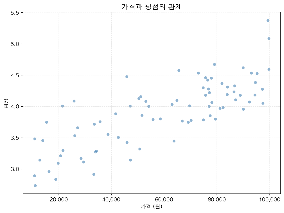
버블 차트 — 크기로 세 번째 변수 표현
np.random.seed(0)x = np.random.randn(30)y = np.random.randn(30)z = np.random.randint(50, 500, 30) # 거품 크기 (세 번째 변수)colors = np.random.rand(30) # 색상 (네 번째 변수)fig, ax = plt.subplots(figsize=(8, 6))scatter = ax.scatter(x, y, s=z, # 마커 크기 c=colors, # 색상 (컬러맵 적용) cmap='viridis', alpha=0.7)plt.colorbar(scatter, ax=ax, label='네 번째 변수')ax.set_title('버블 차트: 4개 변수 동시 표현', fontsize=13)plt.tight_layout()plt.show()